Tuesday, July 12, 2016

Geog 491: Exercise 2- Advanced Model Builder

Goal and Background

The purpose of this lab was to gain experience with more advanced model builder processes. Specifically inline variable substitution and model iterator.

Methods

A model iterator was used in order to perform a certain calculation on Slope, Aspect, and DEM rasters.  This was also used with inline variable substitution to firstly create a buffer.  Then zonal statistics were calculated for all three rasters.  After these processes, the selection tool was used to extract the four different run types: beginner, intermediate, advanced, and expert.  Figure 1 shows the model building process used to create the map shown in Figure 2.
Figure 1: Model used in exercise 2.

Figure 2: Map of the ski runs.
Results

These results shown in Figure 2 may be off by a bit.  Throughout the process, many troubles were run in to.  In the end the map looks correct, but it ultimately could be wrong.

Geog 491: Exercise 1- Review Geoprocessing and Basic Model Builder


Goal and Background

This exercise was used as a refresher for model builder skills and reviewing standard geoprocessing workflows.  The objectives within this exercise consisted of finding suitable areas in the Rocky Mountains for a new ski resort.  The area must follow certain criteria,
  • Snowfall greater than 240 inches.
  • Mean winter temperature below 32 degrees Fahrenheit.
  • 40 miles from a public airport with a tower.
  • Within National Forest Land.
Methods

Below in Figure 1 shows the model builder process of the methods.  First the layers NSF (National Forest Land) land, snow depths polygons, and temperature had to be clipped to the study area.  The Airports feature class also had to be projected into the same coordinate system as the other layers. 

Once this was successfully done, the select tool was used in order to start forming areas based on the above criteria.  Snowfall greater than 240 inches, and mean winter temperature below 32 degree Fahrenheit were selected.  Another selection that needed to be done was to find airports that were public and had a tower.  Once these were selected, a buffer of 40 miles was created around them.

Next, overlay analysis was used in order to find the areas that met the above criteria.  After those processes were finished a new field was added to the new layers data table.  One of the new fields calculated area for kilometers squared and then found any area greater than 2 km^2.  Another field was added in order to calculate the compactness of the resulting polygon. 

Once all of these tools were added to the model it was run successfully and all added to the map.  Figure 1 displays the model used to create the map in Figure 2 of the areas suitable for a new ski resort in the Rocky Mountains.

Figure 1: Exercise 1 model.


Figure 2: Suitable ski areas map.

Monday, May 16, 2016

GIS II: Lab 8- Raster Modeling

Goal and Background

The purpose of this lab was to learn various raster geoprocessing tools in order to build models for sand mining sustainability and sand mining impacts of environmental and culturals risks.  The modeling took place in Trempealeau County, Wisconsin.  The main outcomes of this project include:

  • Building a sand mine suitability model
  • Build a sand mining risk model
  • Overlay the results of the two models to find the best locations for sand mining with minimal environmental and community impact.
Methods

Suitability for mining
1. Generate a spatial data layer to meet geologic criteria 
2. Generate a spatial data layer to meet land use land cover criteria 
3. Generate a spatial data layer to meet distance to railroads criteria 
4. Generate a spatial data layer to meet the slope criteria 
5. Generate a spatial data layer to meet the water-table depth criteria 
6. Combine the five criteria into a suitability index model 
7. Exclude the non-suitable land cover types 

The first part of the lab had us create a mine suitability model based on watershed, land cover, distance to railroad, geology, and slope of Trempeaulau county.  Below in Figure 1 is my model I created in order to produce the results in Figure 2.  Each of these required me to reclass and project the rasters.  This was a difficult process, but ultimately helped me better understand model builder and these tools I used many times throughout the lab.

Figure 1: Model used to create Mine suitability model.
Figure 2: Mine Suitability model.
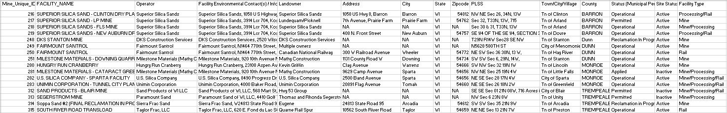
I also created a table  below in Figure 3 of the layers I mapped in order to give a better understanding of the map.

Figure 3: Suitability layer descriptions.


Risk for mining

8. Generate a spatial data layer to measure impact to streams
9. Generate a spatial data layer to measure impact to prime farmland
10. Generate a spatial data layer to measure impact to residential or populated areas
11. Generate a spatial data layer to measure impact to schools
12. Generate a spatial data layer to measure impact on one variable of your choice
13. Combine the factors into a risk model
14. Examine the results in proximity to prime recreational areas

The second part of this lab required us to create a suiltability risk model for these potential new mines.  I once again created the individual layers using model builder.  The risk factors that were mapped were farmland, residential areas, school areas, wildlife areas, and streams.  I ran into less problems in this section but that doesn't mean I didn't have any.  Below in Figure 4 is my model that created my mine impact model in Figure 5.

Figure 4: Model to create mine impact model.
Figure 5: Mine Impact model.
I created another table in Figure 6 in order to give a better understanding of how I mapped these layers.

Figure 6: Mine risk layer descriptions.
Results and Discussion

The optimal locations for these potential mines have to take a lot into consideration.  There are environmental and health risks that many don't realize.  I think it would be interesting to see what the true suitability model looks like of this area or a different area.

Saturday, April 23, 2016

GIS II: Lab 7- Network Analysis

Goal and Background

The main purpose of this lab was to introduce the concept of network analysis.  A network is a system of interconnected elements which are used for modeling transportation, rivers, utilities, etc.  In section 1 of this lab we created a python script that would find active mines within Wisconsin that didn't have a rail loading station on-site and were at least 1.5 kilometers away from a rail line.  In section 2, we used the mines that fit this criteria and used network analysis to route the sand from the mines to the rail terminal.  The results from this were then calculated to see the impact that sand transportation has on roads.  All of the results are hypothetical, but can give a good estimation of the costs.

Methods

For the second section of this lab we needed to find the quickest route from the sand mines to a rail terminal.  Once we practiced with network analysis a bit, we realized it was quite easy to use.  In order to make the lab more challenging, we were instructed to create it all in model builder.  The first step was to create a Make Closest Facility Layer.  This is the type of network analysis model we want to use in order to find the closest rail terminal for each sand mine.  In order to do this we needed to add locations and make one layer the facilities and one layer incidents.  In this case, the facilities were the rail terminals and incidents were the mines.  In order to create the routes, the solve tool was used.  The model was run and added to the map in order to make sure everything ran properly.  Everything ran smoothly on the first try so it was time to move onto the next part of the model.  Next we needed to use a model only tool called Copy Features.  This is basically the same as exporting a selected feature in a mapping session.

Next we needed to project these new layers into a better coordinate system.  Before the were in a coordinate system that used decimal degrees.  We can't calculate miles from this so I projected all of the new layers into a better suited coordinate system for this project.  In the model below in Figure 1, it only shows that wi_counties layer projected, but I also projected the other layers.  I just chose to not include them in the model.  Next we needed to calculate the total road length for the routes by county.  This was done using the tabulate intersection tool.  Once that was calculated I added a field in order to convert the measurements for each county from feet to miles.  Next I created another field where I took the length in miles * 100 * 0.022.  The 100 represents the yearly truck trips from the mine to the rail terminal.  There are 50 yearly trips, but it had to be changed to 100 because the truck do round trips and not just one way.  The 0.022 represents the hypothetical costs per truck mile which is $0.22.  Once again, this model can be seen below in Figure 1.

Figure 1: The model used in order to calculate trucking impacts on roads.

Results and Discussion

After the model was created I put together a map which shows the final results.  This map is shown below in Figure 2.

Figure 2: Trucking routes between suitable mines and rail stations.

As shown above, not all of the routes are within the Wisconsin states lines, two of the routes let to Minnesota.  Many of the routes also went to the same railroad station.  In Figure 3 below, the length in feet and miles are calculated and it shows the final hypothetical trucking costs.  In Figure 4 below the table, I created a graph in order to show which counties are causing the most damage to roads through trucking sand to the rail terminals.


Figure 3: Trucking lengths and costs for each county with a mine.
Figure 4: Trucking costs per county.

As seen above, Chippewa, Barron, and Eau Claire have the highest trucking costs.  By looking at the map we can see that most of the mines and rail terminals are within or surrounds these counties.  The impact that these trucks have on the roads and environment are causing quite a bit of damage.  So we have to ask, is the damage worth it?

Conclusions

This was definitely one of the more difficult labs we've done.  I took a lot of thinking about what tools need to be used and how to use them.  Model builder made things more difficult, but I am glad I got the extra practise with it.  As for the results of this lab, I was interested to see how much these trucking costs would turn out to be.  It was no surprise that the costs were higher in more populated areas like Eau Claire.  I just wonder whether these companies that are involved with sand mining know the damage they're doing to roads and the environment?  I would like to know more about the sand mining industry after doing these labs.  It seems like a huge industry, but are they helping or hurting the environment around them?  It would be interesting to know.

Data Sources

Hart, Maria V., Teresa Adams, and Andrew Schwartz.  "Transportation Impacts of Frac Sand Mining in the MAFC Region: Chippewa County Case Study." University of Wisconsin- Madison, 2013. Web.

Wednesday, April 13, 2016

GIS II: Lab 7 Part 1- Python

Goal

The purpose for this python script is to prepare data for network analysis that will happen in part 2 of this lab.  The script was used to select mines with the following criteria:

1. The mine must be active
2. The mine must not have a rail loading station on-site
3. The mine must not be within 1.5 km of railroads.

The finished product will then be used in the next part of the lab in which we will calculate the impact of trucking sand from mines to rail terminal on local roads.  The script I created for this portion of the lab is pictured below in Figure 1.

Figure 1: Python script for Lab 7.


Friday, April 8, 2016

GIS II: Lab 6- Data Normalization, Geocoding, and Error Assessment

Goal

The goal of this lab was to learn how to geocode by geocoding the locations of sand mines in Wisconsin and comparing the results to the actual locations of the mines.  

The data used for this lab came from the Wisconsin DNR, but the data was incredibly messy.  There were different types of street addresses and PLSS addresses.  Some locations had both types while some only had one or the other.  We were all assigned 16 mines out of 129 and were to normalize the data.  When the normalization was done, the table was then imported into the geocoding toolbar in ArcMap.  After the 16 mines were geocoded, the actual mine locations were imported and compared to the ones we had geocoded.  We also had to compare our personal 16 mines with those of our classmates who had the same mines.  The final step was to create an error table in order to see how well we had geocoded our mines compared to where the actual mine locations were.

Methods

The first step to this lab was to figure out which 16 mines were ours.  We then had to create a new table with normalized data in order for it to be imported into ArcMap.  My 16 mines had their data entered quite differently so normalization was definitely needed.  Below in Figure 1.1 is how I received the data.  Figure 1.2 is the data after I had normalized it.
Figure 1.1: How I received the data from the DNR.

Figure 1.2: Normalized data for my 16 mines.
After normalizing my data it was time to geocode the addresses in ArcMap.  I entered the table that I wanted geocoded and 11 of my addresses were matched, but the other 5 were unmatched.  I added the points to the map along with an imagery base map in order to make it easier to see if the mines were in the correct locations.  I went through the 11 matched addresses first in order to make sure they were matched to the correct addresses.  In order to do this, I zoomed into each matched location to see if I could see the sand mine in that general area.  For the most of them the address was right and I could see the sand mine on the base map.  There were a few, though, that were in completely wrong areas.  In order to fix these I had to look at their PLSS addresses.  I added the Wisconsin townships and sections layers in order to better locate where these sand mines were.  For the 5 that were unmatched I also had to look at the PLSS address.  These sand mines either did not have a street address or their PLSS address was not normalized enough for ArcMap to figure it out.  It took quite a bit of time of struggling to estimate where these mines were, but I eventually geocoded all 16 mines.

Next I need to compare my personal geocoded mines with their actual locations and with my classmates geocoded mines.  The actual locations of the mines layer imported with all 129 mines, though, so I needed to select just my 16 in order to get a better understanding of where my mines actually were.  I created a new layer for the actual locations and did the same with my classmates who geocoded the same mines as I did.  I compared my mines with the actual locations in Figure 2.1 below.  In Figure 2.2 I compared my geocoded mines with my classmates mines.

Figure 2.1: My geocoded mines compared to their actual locations.
Figure 2.1: My geocoded mines compared to my classmates geocoded mines.
For the most part, most of my mines were in the right location compared to their actual locations and to my classmates mines.  I created an error table comparing how off I was in meters compared to the actual locations and classmates locations.  Only about three were completely off, which was my error.  For the rest, they are all in the same location.  The numbers may seem to look like I was completely off, but the scenario was usually that I was in the right location, but I just put my point down the street or a few meters away from where the DNR and my classmates had put theirs.  If the numbers are below 2,500 meters it means that I had the right location, but the points are in different spots.  The table is pictured below in Figure 3.

Figure 3: Meters my mines were off from actual locations and classmates mines.
Discussion

When I first received the data, I could tell there were many errors with all of the mines in the table.  There are three types of errors that can happen with data: gross errors, systematic errors, and random errors.  The first type of error that I saw right away with this data was gross error.  These are just mistakes or oversights that may have happened.  These can be fixed by properly training employees and those collecting the data that the information should be collected in a standardized procedure.  It's obvious that the data was not collected in this manner.  Systematic errors weren't as prominent as gross errors.  This type of error is typically from instruments not being properly calibrated and from changing environmental conditions.  These were a possibility, but were not seen in the data.  Random errors are the leftover ones that don't fit into the first two categories.  All data has random errors, but they are often small errors and can be easily fixed.  I believe these errors were either fixed before the data was received or I just didn't notice them.  

There is also inherent and operational errors.  Inherent errors occur because real world phenomena cannot be accurately represented in data and models.  They are generalized and are sometimes incomplete. The real world is too complicated to represent in data and modeling.  Operational errors occur when the data is actually being collected.  This is also known as user error.  These two types of error occur in all data which means these are present in the data used for this lab.  This leads to the question, how do we know what is accurate data and what is not?  By following set rules and guidelines while collecting and processing data we can ensure that our data will keep it's integrity.  If all data were to be collected and dispersed like the DNR mine data, then many errors would have to be dealt with and much more work would be needed in order to create accurate results.  By following standardized procedures, we can skip unnecessary errors and collect and produce accurate data.

Conclusions

This lab was quite frustrating, but in the end I learned the importance of collecting standardized data.  Collecting data that is organized and understandable is vital in producing accurate findings.  We can't use data that is full of errors and expect to get reliable results.  It is very important to be vigilant throughout the whole scientific process.

Sources

http://resources.arcgis.com/en/help/

Lo, C.P., and Albert K. W. Yeung. "Chapter 4: Data Quality and Data Standards." Concepts and Techniques of Geographic Information Systems. Upper Saddle River, NJ: Pearson Prentice Hall, 2003. 103-134. Print.


Thursday, April 7, 2016

GIS II: Lab 2- Data Downloading, Interoperability, and Working with Projections in Python

Goal

The main purpose of the lab was to become familiar with python and downloading data in an organized fashion.  Below in figure 1 is an example of the general flow of this lab including both parts 1 and 2.

Figure 1: General workflow of lab 2.


Part 1: Data Downloading, Interoperability, and Working with Projections

In order to begin this lab, a large amount of data needed to be downloaded.  This data came from US Department of Transportation, USGS National Map Viewer (National Land Cover Data), USDA Geospatial Data Gateway, Trempealeau County land records, and the USDA NRCS web soil survey.  This was such a great amount of data that it needed to be done in a very organized fashion in order not to lose it or the integrity of the data.  In order to do this I created a file folder for each website that I downloaded data from.  From here the data needed to be unzipped and imported into the correct folders.  After this, I checked the data to make sure it was accurate.  I joined the necessary tables, merged data, and once again made sure it was accurate. I collected information about all of the data that was downloaded and it is shown in figure 2 below.


Figure 2: Information about data download in part 1.


Part 2: Working in Python

The goal for the second part of the lab was to become familiar with python script and apply those skills in order to create maps relevant to this project.  There were three rasters we had to clip to the outline of Trempealeau county.  The python script for that was used for this is in the previous blog post (GIS II: Python).  Writing the script took a of effort before it all worked out, but after it all worked I imported the three rasters now in the shape of Trempealeau county into ArcMap.  The final product of this lab is in figure 3 below.


Figure 3: Trempealeau county maps final product.

Conclusions

The data that was downloaded in part 1 of this lab was very different from each other.  Some of the metadata was complete and informative and others were lacking in those fields.  I learned the importance of organizing my data from the start and continued that process throughout the lab.  In part 2, I really dove into the python process.  I eventually found myself understanding the ins and outs of the whole program, though many frustrating hours had to go into that before the understanding came.  I found that writing the script was actually easier and less confusing at times rather than manually running the tools in ArcMap.  I hope to use python more often after now learning the basics of the program.

Sources

NLCD 2011 Land Cover Metadata:

NLCD 2011 Land Cover data info:

NLCD product legend:

Elevation metadata (northern):

Elevation metadata (southern):